

In December of 2012 Phillip ran a very disappointing 4+ hour marathon, and immediately began plotting and training for his comeback “revenge” marathon.
Does this sound familiar to anyone?
We can edit the time, but haven’t we all thought about our comeback at some point after a bad race?
Four months later Phillip ran a sub 3:30 (a PR!) at the Eugene Marathon in Oregon, definitely what you would call a successful training period.
So, the question is: what type of data can you analyze in your training to determine if your more likely to finish in disappointment or triumphant?
This post may be a little too detailed and scientific for some, but if you love data, and love analyzing your training, this is definitely the article for you!
How can you tell if your race pace is getting faster?
The traditional way to measure your target race pace was to race a shorter distance like a 5K, and extrapolate those results to your goal race distance.
However, if you aren’t planning to race 5Ks or you’re very new to running, you can use some of the unique capabilities of a free website called GraphMyRun.com.
Here’s how it might work…
Like most runners, I run a couple of standard routes every week. I meet some friends on Tuesdays and Fridays at Starbucks for a 5 mile loop. It’s a social run, not a training run, per se.
Hard core runners might think of these as “junk miles”. I think of them as time on my feet, and a chance to see my friends. My point is that there is nothing special about these runs. Let’s take a look to see if there’s anything we can glean from my social runs.
First I went to Garmin Connect and downloaded 6 months worth of my social runs onto my computer. (I exported them in .tcx format, but .gpx would work, too.) On GraphMyRun, I went to the Trends tab, clicked on the Choose Files button, and selected the files.
Here is the graph that was created:
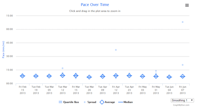
It’s pretty boring — mostly because the y-axis spans such a large range of dates.
There is an outlying data point from the June 7th run that is forcing the upper limit of the y-axis to a 75 min/mile pace. As a result we don’t see any detail down in the 5 to 10 min/mile range — where it counts.
On the Garmin Connect website, the user can click and drag on the graph to zoom in on a portion of the plot,but there is a faster way: Simply click on Spread in the legend (chart key) to turn off the scatter data. Here’s what it looks like with the Spread data turned off:
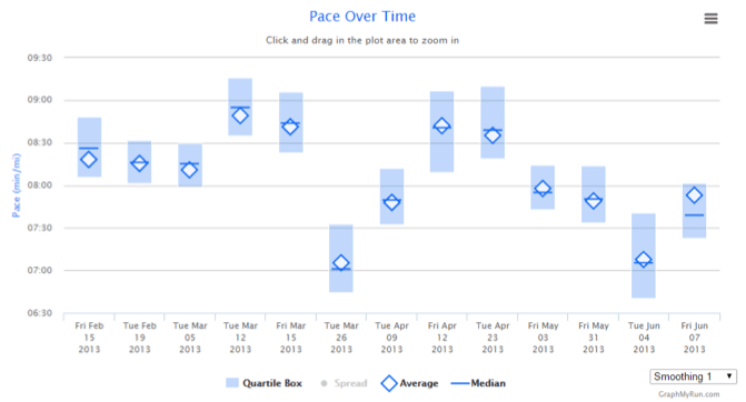
The y-axis rescales automatically and now we start to see some interesting details.
The March 26th and June 4th runs stand out as unusually fast.
By opening up one of those files in the Graph tab, we can see what is happening. This is the March 26th run:
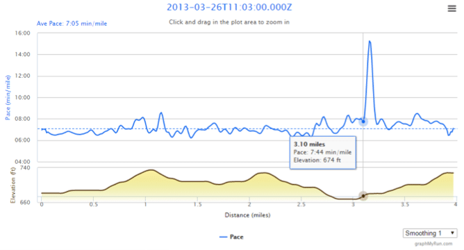
Notice the big spike in my pace right at mile 3.1 where I walked for a bit.
Looking back, I had in fact used this particular run as my own personal 5K race – to tweak my pace zones. (Remember the “traditional approach” to determine marathon pace? Here it is in practice.) I did the same thing on June 4th.
Since these were clearly special cases, I decided not to include them in my “Was I getting faster?” analysis.
Back to the Trends tab, I clicked on the Choose Files button again, but this time excluding those two runs. Here are the results:
This kind of graph is called a “Box Plot”. It was invented by a statistician, and the beautiful thing about it is that using one makes it trivially easy to analyze the data. All we need to know is, “If the Quartile boxes (light blue shaded area) overlap a lot (when looking horizontally across the graph), the data sets aren’t statistically different.”
Keeping this rule in mind, we see that the paces of the first three runs are the same, as their boxes mostly overlap.
Likewise, the paces of the last three runs are the same as each other. But the last three runs are different (faster) than the first three runs because the boxes don’t overlap that much if they were compared side by side.
In other words, this graph shows that I was getting faster even on my social, “time on feet” runs. That’s a sign that my marathon pace should be getting faster, too. (And it did.)
Looking at the data another way, how were my ¼ mile best times changing over these runs? On any training run, we can ask, “How fast was the fastest ¼ mile?” or “How fast was the fastest mile?”.
This is not quite the same as asking “How fast was the fastest ¼ mile split?” or “How fast was the fastest mile split?”
Splits start and end at predefined distances. There are four ¼ mile splits in each mile. They occur from 0 to ¼ mile, ¼ to ½ mile, ½ to ¾ mile, and ¾ to 1 mile.
Mile splits run from 0 to mile 1, mile 1 to 2, and so forth. On the other hand, the fastest ¼ mile sub-segment might start at mile 2.16 and end at mile 2.41. For sure it’s a ¼ mile long, but it doesn’t start at any particular place.
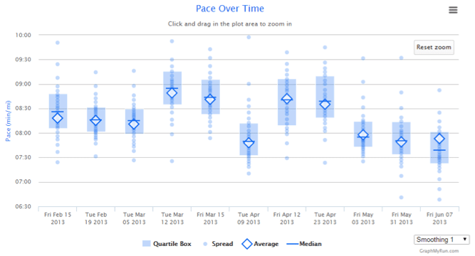
By selecting “Fastest Sub-Segment Trends” from the drop down button on the Trends tab, GraphMyRun will automatically find your fastest ¼ mile, ½ mile, mile, and 5K sub-segments. Here are the results for the 11 runs of our previous graph:

Clicking on the 1 mile and 5Ks labels in the legend (chart key) to turn off those data sets, zooms in on the ¼ and ½ mile results shown below:
The results are a little less compelling than the previous Box Plot, but they do show a decreasing trend. Even when running “junk miles” without trying to hit a specific pace, I was running them a little bit faster. My fastest ¼ mile and ½ mile sub-segments were gradually decreasing. I was getting comfortable running faster. My easy pace was getting faster and my marathon pace was decreasing, too.
In my 2015 training cycle I’ll look at my 5K race times to gauge my progress in the traditional way. But now I can also look at my social runs to see if I’m following the same trends that I showed in 2013.
 Phil Miller is a marathon runner and triathlete. He PRed and BQed at the Eugene Marathon when he got serious about training at age 53. A scientist and inventor with over 10 patents, he created GraphMyRun.com as a hobby for his fellow runners in the Plano Pacers running group. He enjoys woodworking and is a certified beer judge by the BJCP. He is currently writing a book on Product Development.


3 Responses
Thanks for the article! I love me the data, and I’m a big fan of the scientific method.
As such, I’m compelled to point out the lack of correlation between easy run pace and fitness. For example, I used to run my easy runs faster, but these days Coach Jamie will call me on it, so I run them slow. I hope that means my fitness hasn’t decreased!
The fact is, easy pace is self-selected. It will vary for many reasons, such as the amount of fatigue from your last workout. One might just as easily determine that you’re not running your workouts hard enough!
Or maybe your running partner is getting more fit, and you’re accommodating their pace. You get the idea.
Even if we accept that faster easy pace = better fitness, you chose those data points to draw the conclusion you were looking for. One could just as easily look at February through April and conclude you were getting less fit.
Despite my grumbles, GraphMyRun looks incredible, and I appreciate the pointers! The link to it in the article needs to be fixed though.
You are so right Brian! That is exactly right (hence my comment on the FB page!) You are proof of that, and we need to be very careful with this, but Phil did mention that he does not care about what pace he does for his easy runs as they are for friends. Hopefully other readers will be as diligent as you to pay attention to this. Thank you for your thoughts, hope you are resting up!
Just saw your comment on FB!
A more useful test might be to pull in multiple instances of the same workout, and compare them to each other. But Phil’s example is a lot easier to grasp, and the concepts apply regardless.
Yep, I’m resting and catching up on all the little things I let slide lately! Thanks Tina!